How to Design a Business Card
August 21, 2013 Leave a comment
Business cards are still the most widely used form of marketing there is. Even with social media and cell phones, the business card is the quickest and most transportable form of information around. So what should you advertise in such prime real estate to be noticed? Just like any other strong marketing material you need to keep in mind the basic principles of design when laying out your business card.
You use to have to consider how much money you were willing to spend before you could figure out how many colors you were going to use in your business card design. But with digital printing presses becoming the norm it’s much more economical to print a four-color process card. With four-color process the sky is the limit with colors; however, you can still get a really clean and memorable design using only two colors and really nice paper stock.
A picture is worth a thousand words
You could just put some words on your card but that would mean someone would have to read it to know who you are and what you do. If you have a well-thought out image to go with your information, then someone could take one glance at it to determine what it is for before getting close enough to read the type.
Three questions to answer when choosing an image:
- What image will convey what you do with one glance?
- Does it look good at a small scale?
- Does it have a clean area for text if you are planning to use it on the whole card”
Picture 1 
Picture 2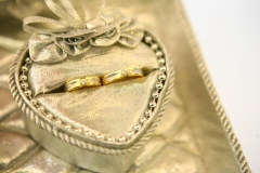
Both images feature two wedding rings and both images have a similar pallet of colors; however, one is a better image to use than the other for a couple of reasons. While you could extend the white space on the right in picture 2 to make room for Victoria’s information, it would feel cramped and would be overshadowed by the image. Picture 1 on the other hand has a lot of unencumbered space that text would lay nicely on top of, allowing Victoria’s name to take center stage. Another reason picture 1 is the better choice for a business card is the impression it gives from a distance. Picture 1’s image is strong and from a distance still comes across as a pair of wedding rings, while the rings in picture 2 do not stand out as much and are upstaged by the box they are resting in. From a distance it is hard to distinguish immediately that it is a pair of wedding rings.
Say it like you mean it
Now that we’ve chosen the image for Victoria’s cards we need to add her information to the card. Easy enough, right? First, let’s go over a few key design points:
- Choose your fonts wisely. Victoria is a wedding planner not a preschool teacher or a rock band, so we need to look for a classic script or serif font to go with her classic wedding look. For you preschool teachers out there, feel free to use Comic Sans and for rock bands any grungy font will do.
- Allow the image to guide where you will place your text and how you will justify your text. For our image we could do a right justification or a combination of centered name and title with right-justified contact information.
- Edit what you put on your card since too much information in such a small space just gets lost and nothing will stand out as important. Who you are, what you do and two forms of contact information should suffice. Always include your website, if you have one, because it is another area where you have the ability to go into more detail about what you do and potentially sell to a potential client.

Clean, elegant and effective is what Victoria got with this business card design. Remember your business card can be the most effective advertising tool if designed properly.
WePrintQuick.com gives you professional quality printing for a great deal less than you would expect. We’re an online service provided by Eveready Printing, Inc.


